Optimizing Your User Experience
- Tobi Amira
- Emmanuel Okorie
- Kelechi Okwuriki (Unlicensed)
The following step is to optimize your user experience once the integration is complete. It's critical to inform your payers that this is not the same as a standard bank transfer, which requires them to either call you to confirm the transfer or give proof of payment to your support team. We've discovered that the top user experiences usually include the following:
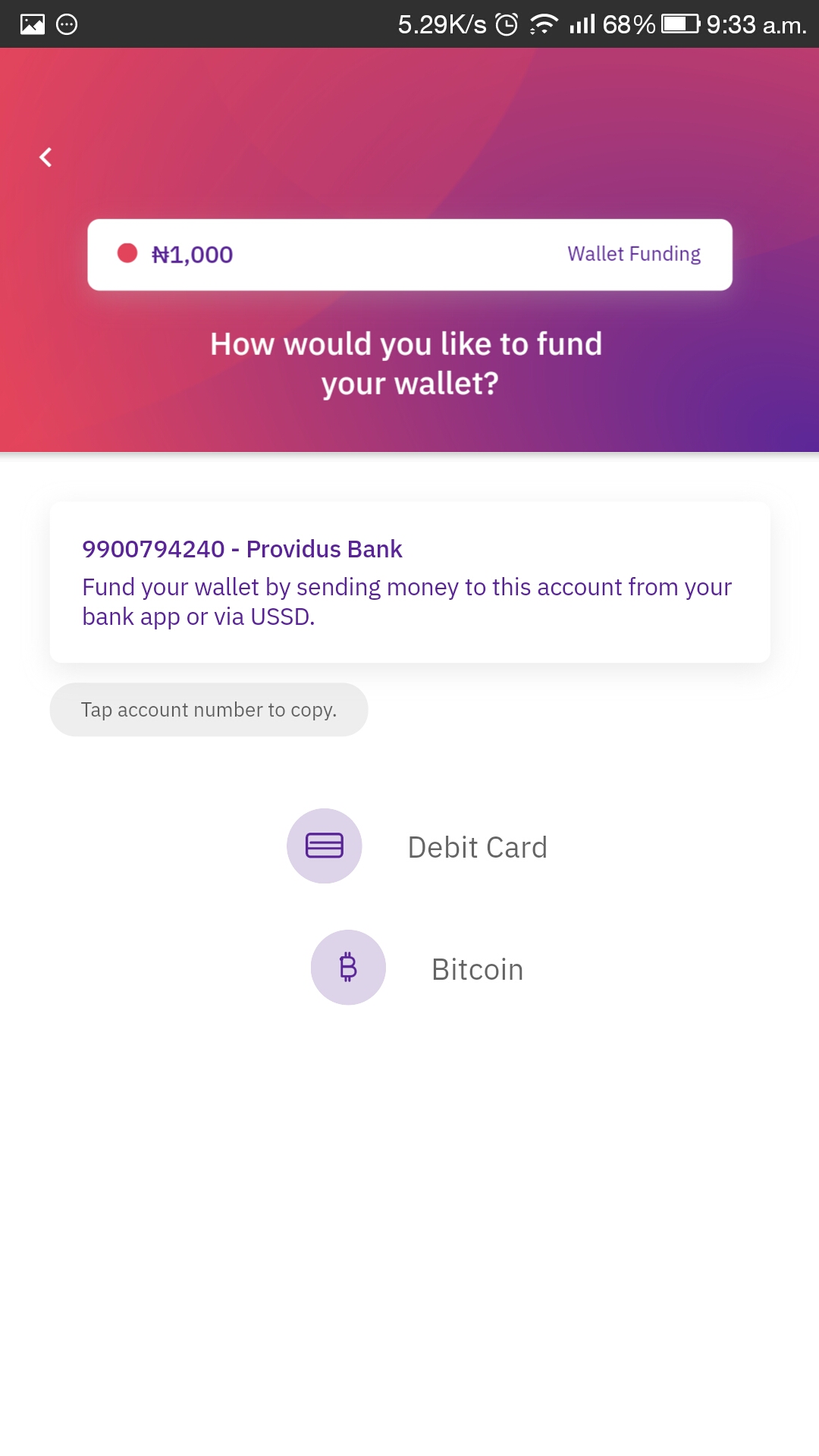
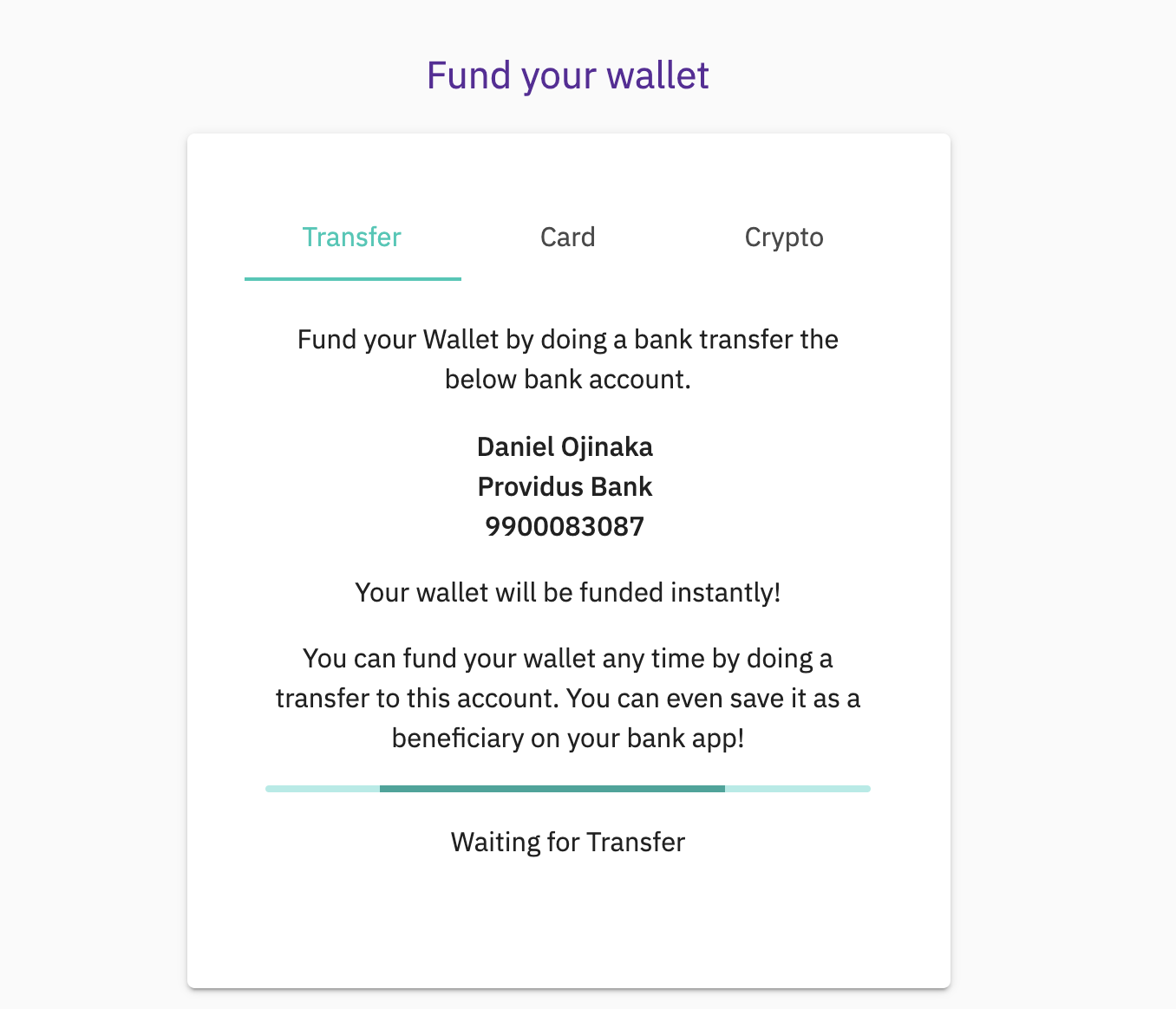
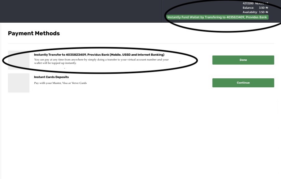
Informs the customer that their account number is unique to them: - The consumer has to know that this account number is theirs and that they can pay with it whenever they want, from the user experience. If you can persuade the customer to save the account number as a beneficiary in their banking app, you'll get bonus points. The following is an example of the text:
“Your virtual account number is 9900099000 XYZ Bank. You can top up your wallet instantly by doing a transfer to this account number. Save it as a beneficiary on your banking app so you can send money to it at any time!”
Lets the customer know that their payment will be acknowledged instantly : - If you have a page dedicated to payment, it’s important to let the payer know that his payment will be received on the system immediately. This is typically achieved in a combination of two ways:
By making the page alive, some type of loading bar or icon with a waiting for payment text is typically good enough to attract the users attention and have him start to see this as something that is fully automated.
By having some text letting the payer know his/her transfer will be confirmed instantly.
Here are a few pictures of what we recommend the user experience should look like:
UX Images (Click to Expand) |
||
|---|---|---|
|
|
|
|
|
|
|